Wednesday, December 3, 2014

Grain Design


I was asked to showcase an admirable graphic design firm, and after some research, Grain has my vote. I chose them because they are an ethical, environmentally responsible firm with some very high profile accounts (Intel, Nissan USA, Brown University, Seattle Art Museum, Anthropologie, American Design Club, Rhode Island School of Design.. to name a few).
Grain, located in Seattle, was founded in 2007 at the Rhode Island School of Design. The firm is not limited to graphic design, but also branches out into industrial design as well as interior design. Grain is a collaborative of designers with "the shared vision of a sustainable future... driven by the belief that social values and good business are not mutually exclusive, but are, in fact, partners." For example, the company designed a product called Ty, a 100% recyclable shower curtain, available internationally.


Grain is a member of 1% For The Planet, so 1% of their annual revenue goes back to environmental non-profit organizations like The Organic Seed Alliance, PCC Farmland Trust, The Nature Conservatory, and the National Park Foundation. Employees also regularly volunteer at Project H Seattle, and are co-organizers with JOIN: Design Seattle.

Grain is committed to a sense of community and craftsmanship. Their products are made with care in small batches, in partnership with local expert artisans and professionals.

I would love to work for (or own...) a company like this. I admire their strong ethical values and obviously incredible business strategy, and like to see this kind of company succeed. I think it's a delicate balance to have both a successful and truly ethical business.

Here's some of Grain's work that I like...
Seattle Design Festival

Woonwinkel Design Market Poster
Textile Design
Blak Designmart

Grain's website and blog didn't have much of a portfolio, but the work that's available online looks trendy and modern. Makes me think that Seattle would be a good spot for an internship...

Saturday, November 22, 2014

more recent work!

these two are from a still-life project we had in drawing & illustration, experimenting with pen and ink. we needed to first create the still life, draw it in pencil, trace with ink, and add some shading, then paint with watercolour (watered down gouache). I wish I had been brave enough to use some blue in the apple, and some green in the lemon, I think I could have given it more dimension that way. Also the circle around the shine on the apple was a horrible idea. Other than that, I'm super proud. Love this technique.

this is an earlier project for drawing & illustration, a still-life object (my owl change bank), focusing on light and shadow

 this project was one of my favourite so far! we needed to create a fake newspaper article (focusing on the layout) and draw it using only ink. this was meant to give us some insight on how much more of a process printing was before mechanized printing presses existed. this was REALLY fun to create!

i'm extra proud of this drawing (it's just a rough... stay tuned for the finished product) it's the beginning of an art-nouveau style movie poster for pulp fiction, a project i'm working on for history of graphic design. 


this is a project for my conceptual thinking class, we needed to create symbols for each of the four elements: earth, water, fire and wind. i decided to work with my concept of "mother nature" and changed her hair to represent each of the elements. i'm extra proud of the fire one. i used prismacolour markers.

some recent work!

for this assignment, we were asked to make a 6x6 box for hermle, a german clock company founded in 1922. i used gouache (ultramarine, bronze, and ochre) and watercolour paper, rubber cement to assemble it. i learned that rubber cement was the WRONG choice of adhesive (took forever to dry, didn't stick properly, stained my paint in some spots....) i wish i used double sided tape (grrrr..) LOTS of hours to paint this guy, and lots more hours to assemble it, but overall i'm really pleased with how it turned out. i also think this project helped me really feel confident using gouache paint. it's really hard to get a smooth flat finish.
here's the front of the box, featuring the "h" from the hermle logo, and roman numerals around the clock face. 

this is the top of the box, featuring the hermle logo, with stars on a blue background. 

this is the back panel, where the label would go (saying what's inside the box), and a text box for description of the product.

this is the right panel, with the moon, stars, and a bronze gear. 

this is the left panel, with the sun and a bronze gear. i added a shadow around the gear to help it stand out against the sun.

and my name at the bottom!

Thursday, October 23, 2014

inspiration today


some work of mine... so far, so good!


here's a picture of my unfinished advertisement for a fishing lodge- gouache paint. I'll post a picture of the final product soon!


 Some detail shots of my unfinished christmas theme illuminated manuscript... we were given lyrics from "song from a winter's night" by sarah maclachlan (not one i would have chosen for myself). i'm pretty proud of this piece! i used prismacolor markers, a calligraphy marker and a gold-leaf pen. i'll post a photo of the finished product soon!

here's another detail picture from my illuminated manuscript, before i filled it in with colour. 


for this exercise, we needed to create simple symbols to represent actions... from left to right, these are reading, yoga, gardening, cooking, and hiking. I wish I added a flower to the gardening symbol, it's a little unclear. the book could have been a bit simpler.


sorry for the blurry image, i'll replace it soon! this is one of my first attempts at photoshop, an advertisement for a hot air balloon company. i added all the balloons in, and designed the text. i'm super proud of it, and really impressed with myself!! i was really nervous for photoshop class, but i think i'm picking it up pretty quickly. i'm really excited to become a pro ;)


here's my modern take on a personal coat of arms for history of graphic design class. i relied on symbolism pretty heavily here, which required a bit of research. the left and right quadrants represent my maternal and paternal heritages, the left representing my Hendrickson side. there's a swedish flag in the background, and a house with a crown representing the meaning of "hendrickson" (ruler of the house). on the right, a french flag with a open-armed heart representing my mother's maiden name, francoeur (generous or open heart). on the top quadrant i drew the ocean and a sunrise, representing my birthplace (white rock) and my love of the pacific. i used the bottom quadrant to have some fun, and put a "charge" of a cat, because i love cats. overall i loved this project, loved using my markers, and LOVED the outcome. so fun. 


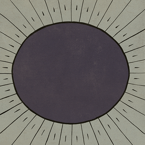
 here's an assignment i did for my critical thinking class, using shape and colour to inspire an emotion. i used yellow concentric circles to create happy energy. i used yellow for the centre dot to draw the eye in, then push it back out through the red and the orange. i wanted to create a kind of rippling radiation. i used these warm yellows oranges and reds to create a warmth to inspire happiness and energy. we were asked to quiz people on how the image made them feel, to see if we were successful, and many people agreed that the image made them happy, but only one concluded that it had an energetic feel. 


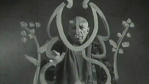
these last five photos are from a doodle assignment we had in critical thinking. i used my prismacolor markers, and fooled around with illustrative and realistic styles. i'm proud of how realistic i could make the frame in the last image. these doodles were super fun to draw and i had too much fun (for once) doing my homework... i can't believe this is HOMEWORK!!! loving this program.


Saturday, October 18, 2014

fun package design


For this assignment we were asked to look for interesting package designs, products that really looked creative and different from the norm. I found a few different things, i was pretty surprised to find that most of the products are from the food and beverage industry! i guess there are so many of the same (or nearly the same) products in this particular industry that companies need to think outside the box in terms of packaging to really stand out. i really like packaging that makes something ordinary look like something else (see moustache paintbrushes and politicians brewing in a teapot). one way to make a consumer want to spend a few extra dollars is to have witty or inspired packaging. here's what I found...