
Thursday, October 23, 2014
some work of mine... so far, so good!

here's a picture of my unfinished advertisement for a fishing lodge- gouache paint. I'll post a picture of the final product soon!


Some detail shots of my unfinished christmas theme illuminated manuscript... we were given lyrics from "song from a winter's night" by sarah maclachlan (not one i would have chosen for myself). i'm pretty proud of this piece! i used prismacolor markers, a calligraphy marker and a gold-leaf pen. i'll post a photo of the finished product soon!

here's another detail picture from my illuminated manuscript, before i filled it in with colour.

for this exercise, we needed to create simple symbols to represent actions... from left to right, these are reading, yoga, gardening, cooking, and hiking. I wish I added a flower to the gardening symbol, it's a little unclear. the book could have been a bit simpler.

sorry for the blurry image, i'll replace it soon! this is one of my first attempts at photoshop, an advertisement for a hot air balloon company. i added all the balloons in, and designed the text. i'm super proud of it, and really impressed with myself!! i was really nervous for photoshop class, but i think i'm picking it up pretty quickly. i'm really excited to become a pro ;)

here's my modern take on a personal coat of arms for history of graphic design class. i relied on symbolism pretty heavily here, which required a bit of research. the left and right quadrants represent my maternal and paternal heritages, the left representing my Hendrickson side. there's a swedish flag in the background, and a house with a crown representing the meaning of "hendrickson" (ruler of the house). on the right, a french flag with a open-armed heart representing my mother's maiden name, francoeur (generous or open heart). on the top quadrant i drew the ocean and a sunrise, representing my birthplace (white rock) and my love of the pacific. i used the bottom quadrant to have some fun, and put a "charge" of a cat, because i love cats. overall i loved this project, loved using my markers, and LOVED the outcome. so fun.

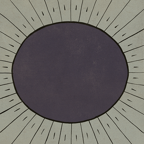
here's an assignment i did for my critical thinking class, using shape and colour to inspire an emotion. i used yellow concentric circles to create happy energy. i used yellow for the centre dot to draw the eye in, then push it back out through the red and the orange. i wanted to create a kind of rippling radiation. i used these warm yellows oranges and reds to create a warmth to inspire happiness and energy. we were asked to quiz people on how the image made them feel, to see if we were successful, and many people agreed that the image made them happy, but only one concluded that it had an energetic feel.


these last five photos are from a doodle assignment we had in critical thinking. i used my prismacolor markers, and fooled around with illustrative and realistic styles. i'm proud of how realistic i could make the frame in the last image. these doodles were super fun to draw and i had too much fun (for once) doing my homework... i can't believe this is HOMEWORK!!! loving this program.
Saturday, October 18, 2014
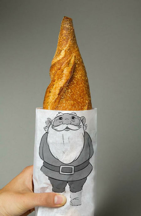
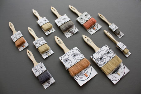
fun package design
For this assignment we were asked to look for interesting package designs, products that really looked creative and different from the norm. I found a few different things, i was pretty surprised to find that most of the products are from the food and beverage industry! i guess there are so many of the same (or nearly the same) products in this particular industry that companies need to think outside the box in terms of packaging to really stand out. i really like packaging that makes something ordinary look like something else (see moustache paintbrushes and politicians brewing in a teapot). one way to make a consumer want to spend a few extra dollars is to have witty or inspired packaging. here's what I found...


Sunday, October 12, 2014


Tuesday, October 7, 2014
artists who've inspired me
andy warhol

to me, his eye for colour was inspiring, and his way of thinking was radical.
_________________________________________________________________________________
egon scheile

The Artist's Wife (1917)
schiele managed to convey so much with minimal detail and colour. his style was groundbreaking.
_________________________________________________________________________________
willem de kooning

Untitled 1 (1977)
i'm inspired by de kooning's intuitive colour choices and free brush strokes.
_________________________________________________________________________________
douglas coupland

Gum Head, (2014)
coupland's art and writing speaks about the contemporary landscape of pop culture, which i admire. he lives in vancouver and his public art is a huge part of the dynamic of the city.
_________________________________________________________________________________
Subscribe to:
Posts (Atom)